AI Prompt for Microsoft 365 Infographic Comparison
By using this prompt, creators can quickly and easily compare the output of various AI image models, experimenting with different styles, and finding the perfect visual representation for their Microsoft 365 ecosystem content. This prompt is particularly useful for educators, writers, and developers who can use the generated infographics to explain complex concepts and illustrate the potential of AI image generation.
Related Keywords
Main AI Prompt
Main Prompt Content
"Using the provided reference image as a benchmark for a clean, readable business infographic style, create a 16:9 comparison slide that demonstrates how different image generation models render an infographic about {argument name="topic" default="Microsoft 365"}. Replace the Japanese DX report content with four separate sample infographic outputs arranged in a 2×2 grid on a white background.
Layout: Use exactly 4 panels, each showing a different Microsoft 365 ecosystem diagram, with a small horizontal orange model label near the left side of that panel. The four labels must be: 1) {argument name="top left model label" default="GPT-Image-2"}, 2) {argument name="top right model label" default="GPT-Image-1.5"}, 3) {argument name="bottom left model label" default="MAI Image 2 Efficient"}, and 4) {argument name="bottom right model label" default="Flux.2 Flex"}.
Panel content: Each panel should visualize Microsoft 365 at the center with surrounding app icons and labels. Include recognizable Microsoft-style app tiles/icons such as Word, Excel, PowerPoint, Outlook, Teams, OneDrive, SharePoint, OneNote, Forms, Planner, Loop, and Copilot where appropriate. Make the top-left panel the most polished and text-readable, with a circular hub-and-spoke diagram and concise app descriptions. Make the top-right panel simpler, with icons connected to a central Microsoft 365 box. Make the bottom-left panel look like a structured category chart with Productivity, Collaboration, and Storage sections. Make the bottom-right panel look like a softer radial diagram with category headings and some imperfect or slightly inconsistent labels to imply model comparison.
Style: Clean corporate SaaS infographic aesthetic, lots of white space, thin gray connector lines, Microsoft-like blue/green/orange/purple icon colors, crisp readable English text. Preserve the reference image’s practical business-document feel, but do not recreate its Japanese government-report layout, red warning sections, arrows, or original text.
Constraints: Show exactly four model comparison examples, no extra title banner, no watermark, no Japanese text, and keep all text legible enough to compare model performance."
You might also like
Hand-picked related prompts from Minimalism.
Character Design
By 名前って大事
AI Prompt for Character Design and Background Illustrations
Illustration
design
character
marketing
"映像戦略の策定とキャラクターのデザインを同時に行う。"
Infographic
By neural nets.
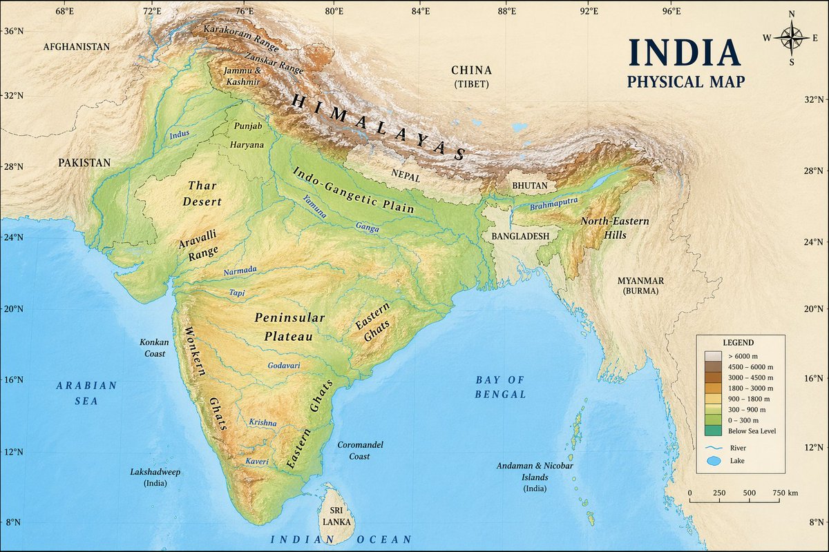
AI Prompt for Creating Visual Illustrations on Maps
Illustration
Infographics
Visual Aids
Artists
Designers
"an image on a {argument name="country" default="indian"} physical map"
Female Character
By VisualGPT
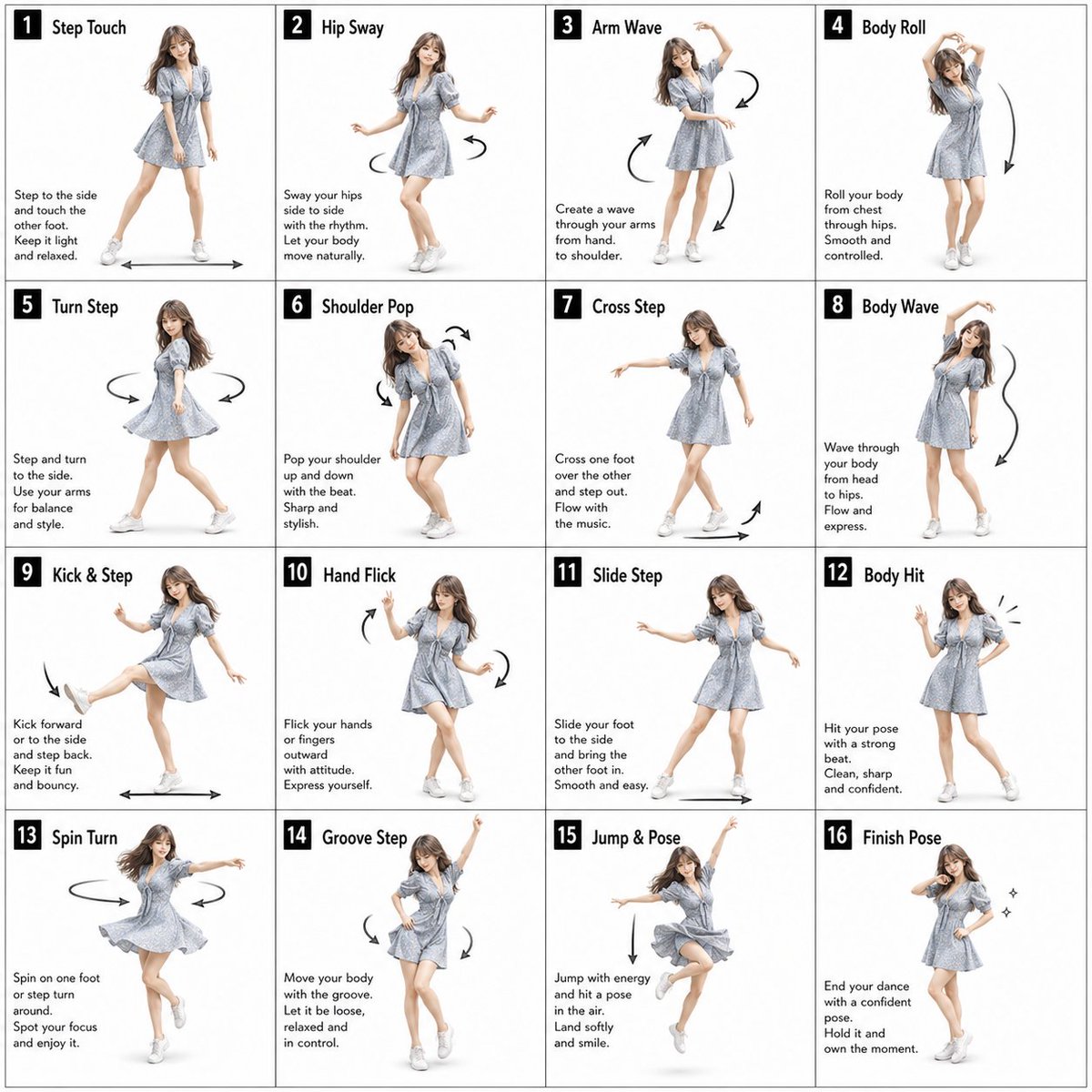
AI Prompt for 16-Pose Dance Studio Poster with Female Character
photography
Poster
Infographic
{"type":"dance pose instruction sheet","style":"clean studio instructional poster, fashion-photo collage, bright white b...
Premium
Latest Discoveries
Explore our most recently added high-quality AI prompts.

Retro Poster
By SOCIAI(ソシアイ)
AI Prompt for Retro-Style Poster Illustrations
Illustration
retro
Poster
Art
"vintage monochrome illustration, black and white only, high contrast shadows, retro print style, subtle paper texture, g..."
Cinematic Portrait
By Miz
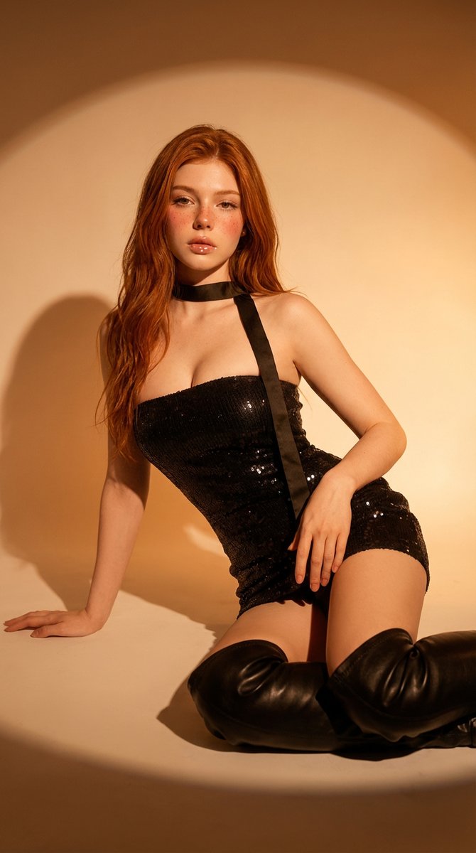
AI Prompt for Cinematic Studio Portrait
portrait
fashion
studio
"{
"prompt": "Studio portrait of a young adult woman with long wavy red hair and fair freckled skin, wearing a black se..."

Chibi Typography
By みどるっち|AIで人生アップデート
AI Prompt for Explosive Japanese X Monetization Thumbnail Design
anime
chibi
typography
thumbnail
Monetization
"Create a flashy Japanese YouTube thumbnail in a high-impact anime marketing style, 16:9 landscape, packed with neon gree..."